I'm a graphic designer and front end developer.
Let's work on something together!
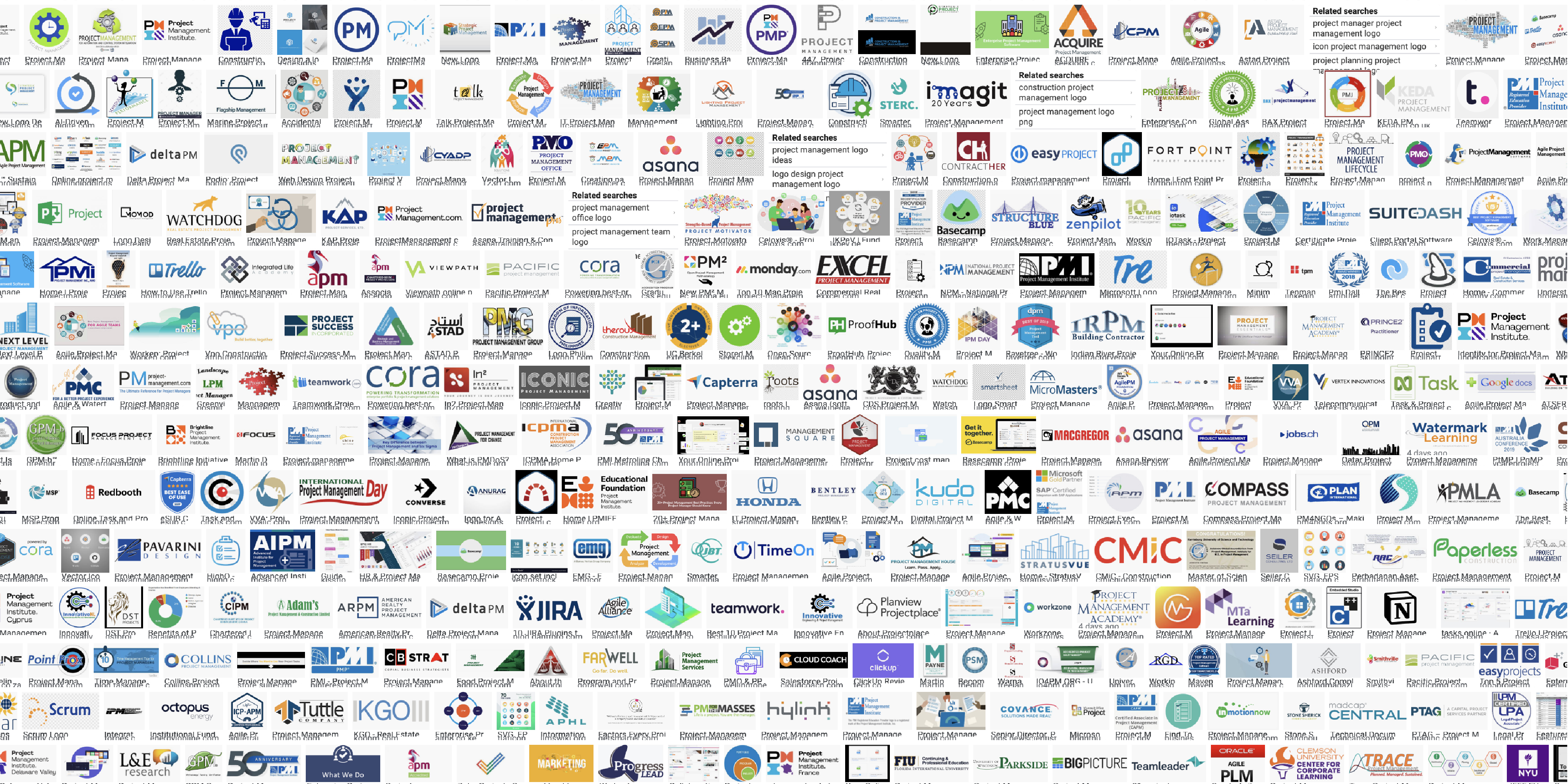
Like many industries, project management app designers generally plays it safe with blues and greys,
classic colors that exhume stability and security.
Since Hootsi was to be more than project management, with inventory control being a close second
function of the app, I delved into the inventory management field and found the same trend of blues
and greys.

A closer look at Googles recommended top project management apps showcases this trend. The second
most common color seems to be green, and red is rarely used.
It’s so boring to follow color trends. I always go for what will stand out the most in the extremely
crowded field. It was between pink and purple, and purple won.
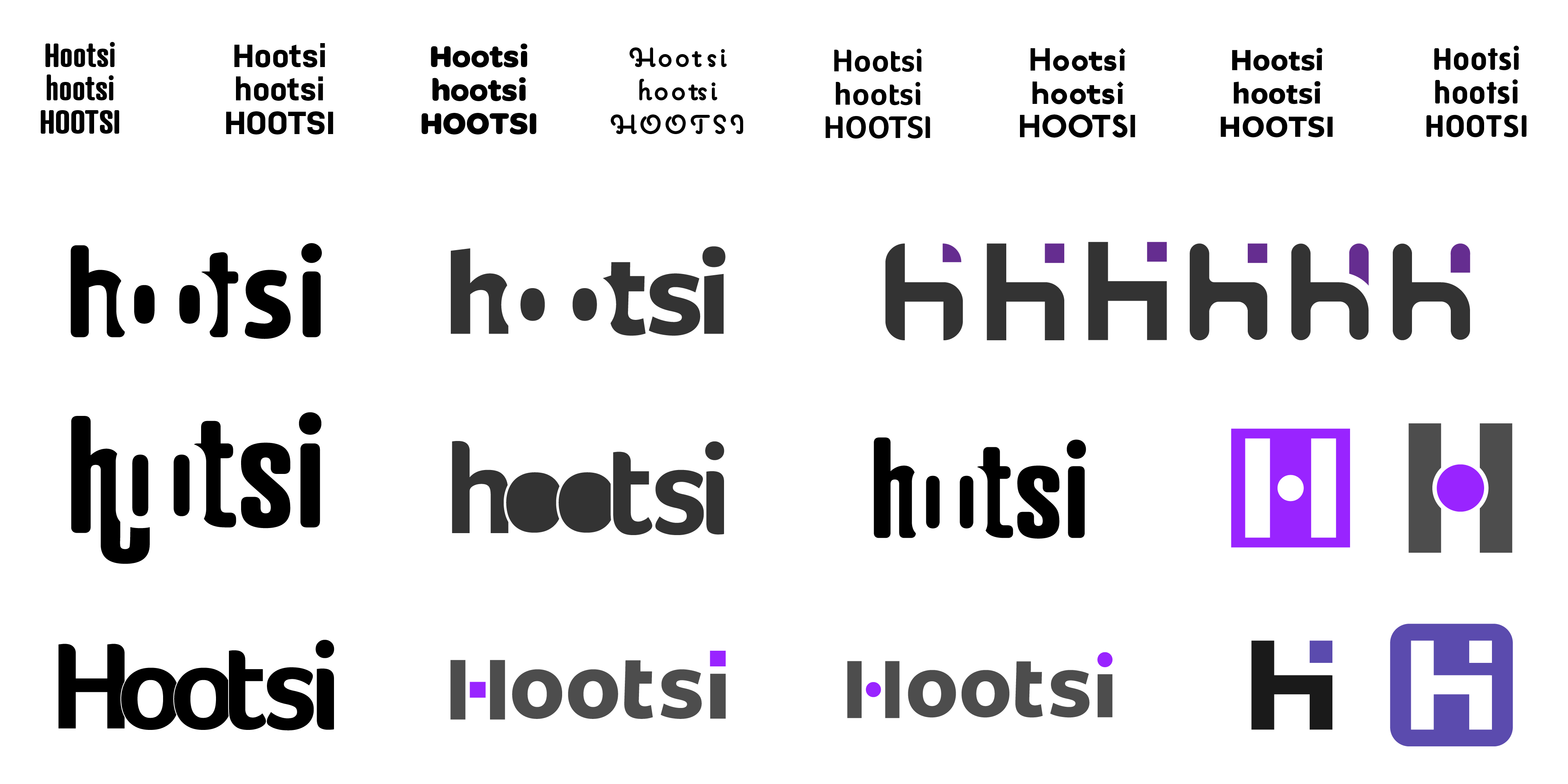
Instructions were to create a wordmark, so I usually tackle this by creating an artboard full of 16
of
the company name typed out in all lowercase, all uppercase, and capitalized. One by one, I go down
the
list and liberally choose fonts that fit.
I then eliminate half of the ones that are too similar or just don’t fit compared to others, and
repeat until I have 4 left. This is when I consult the client, and we decided on Freight Sans Pro, a
nice humanist sans-serif font.

After playing around with a lot of variation (most of which was on paper that I seem to have lost), the logo symbol was created by slightly manipulating the Freight Sans Pro letter H, and combining it with the i. Simple and friendly, it’s literally saying “Hi”.
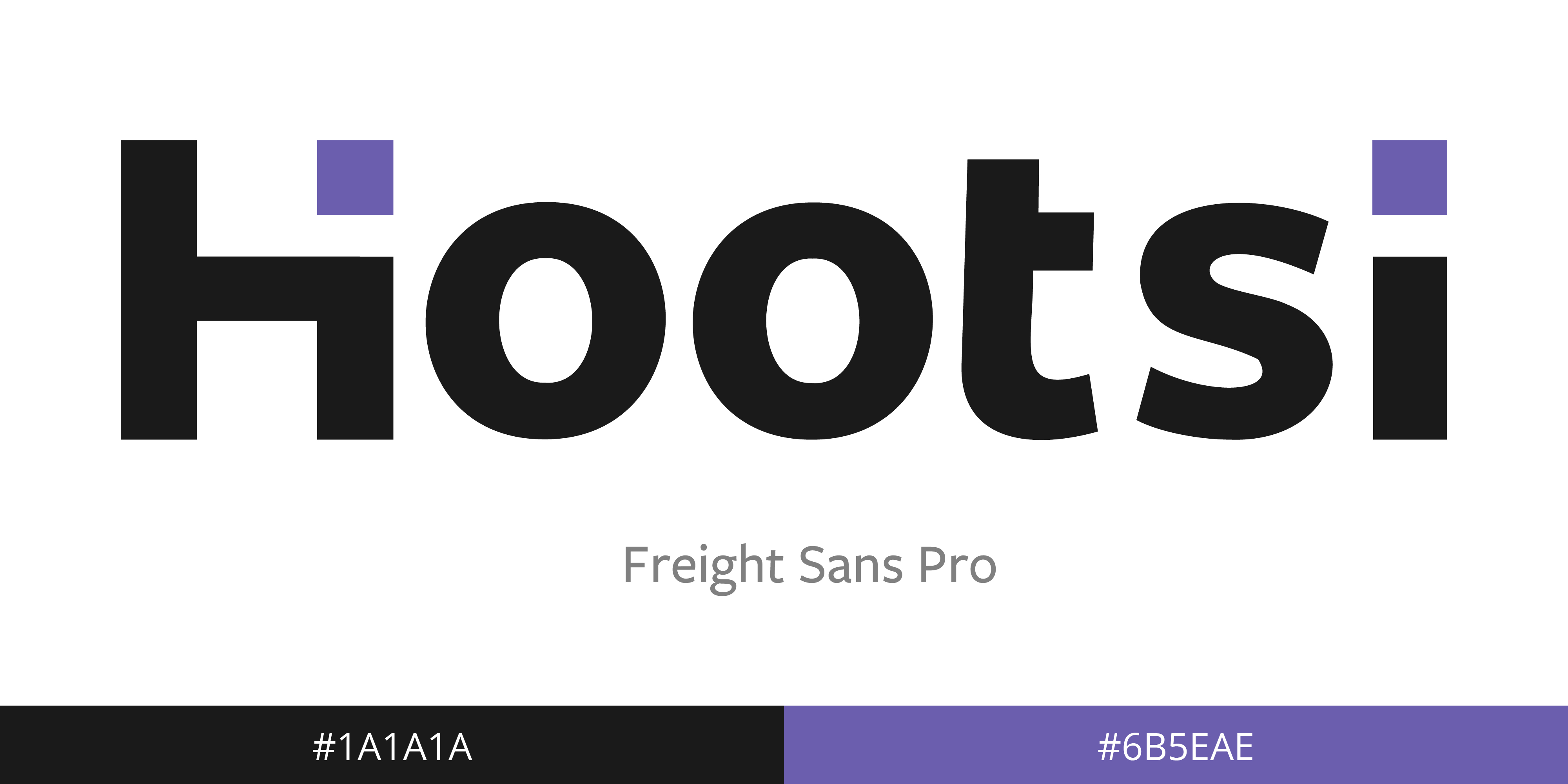
Not much variation was made to the font, except removing the left crossbar of the letter “t”, and
changing the dot of the letter “i” to a square to match the center of the H.
For colors, we went through several purples before deciding on this one. We wanted everything to
feel
friendly, and the soft tone contrasted with the dark gray worked great.

On a dark background, I opt for an all white logo. If the background permits, I will use purple
accents. Otherwise, it’s always grey text and purple accent.
This is somethign that should be done even at the early stages of drafting. As soon as you think
you’re on to something, you should scale it way down, scale it way up, make it black, make it white,
and see how you feel about it after.